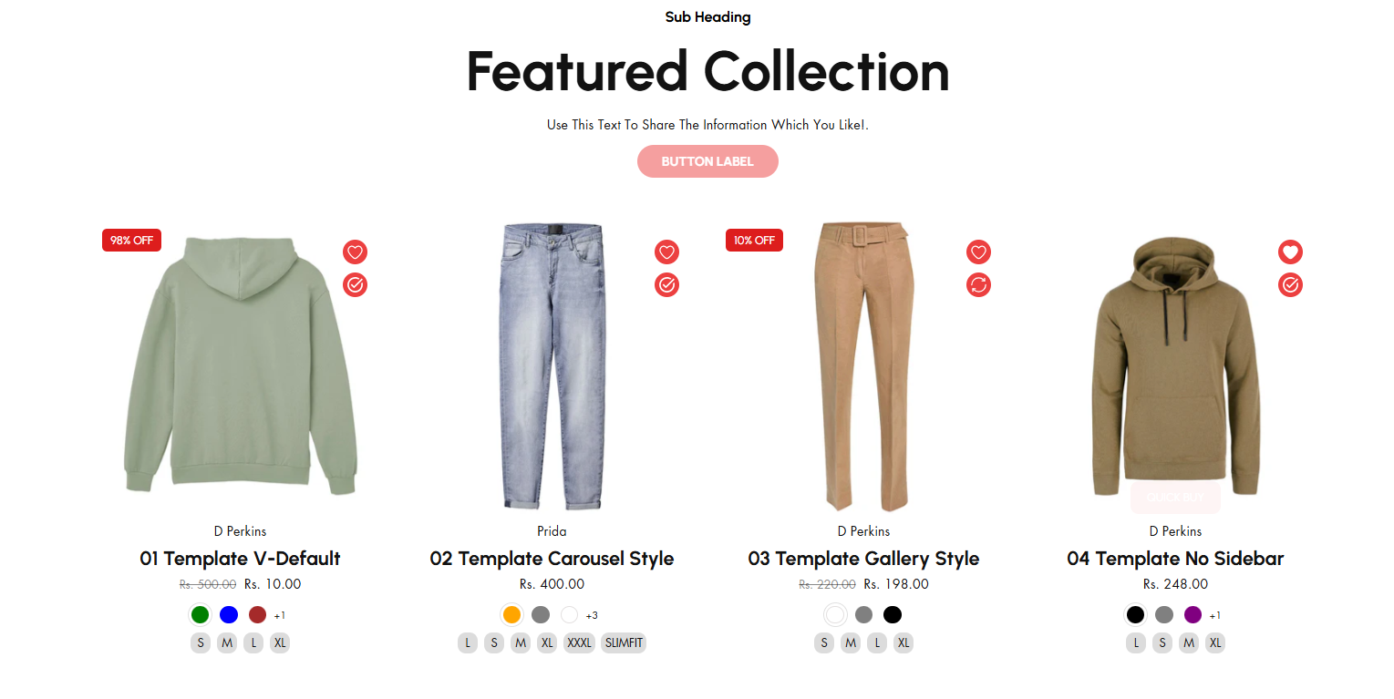
Featured Collection
The Featured Collection section in Shopify allows you to highlight a specific collection of products on your store's homepage or other pages. This is a great way to showcase popular, new, or seasonal items.
Navigate to Shopify Admin > Online Store > Themes.
Click Customize on your active theme.
In the Theme Editor, click Add Section > Featured collection
Create a product and assign the created collection in the customizer
Show Full Width: Expands the section across the entire screen width.
Right & Left Spacing : Add spacing to the Full Width layout (applies in full-width mode).
Heading: Set a custom title (e.g., "Hot & Top Trends").
Heading Size: Choose from Small, Medium, or Large (Default: Medium).
Subheading: Add additional text if needed.
Body Text: Add a description (e.g., "Best arrivals this week").
Button Label: Add text (e.g., "Shop Now").
Button Link: Set the URL destination.
Use Outline Button style: Change the button to an outlined style.
Column alignment: Column can be aligned as per the content alignment requirement (Left,Right)
Collection: Choose a collection assigned in backend (Product Creations) (creating collection).
Maximum Products to Show: Define how many products to display totally.
Number of columns on desktop: Choose how many items appear in a row on desktop.
Show "View All" Button: Enable to display a View All button click to display all collection.
"View All" Button Style: There are 2 types of button can choose either solid button or outline button.
Color scheme : You can customize the section’s appearance by changing the text color, background color, and more using preset color options.
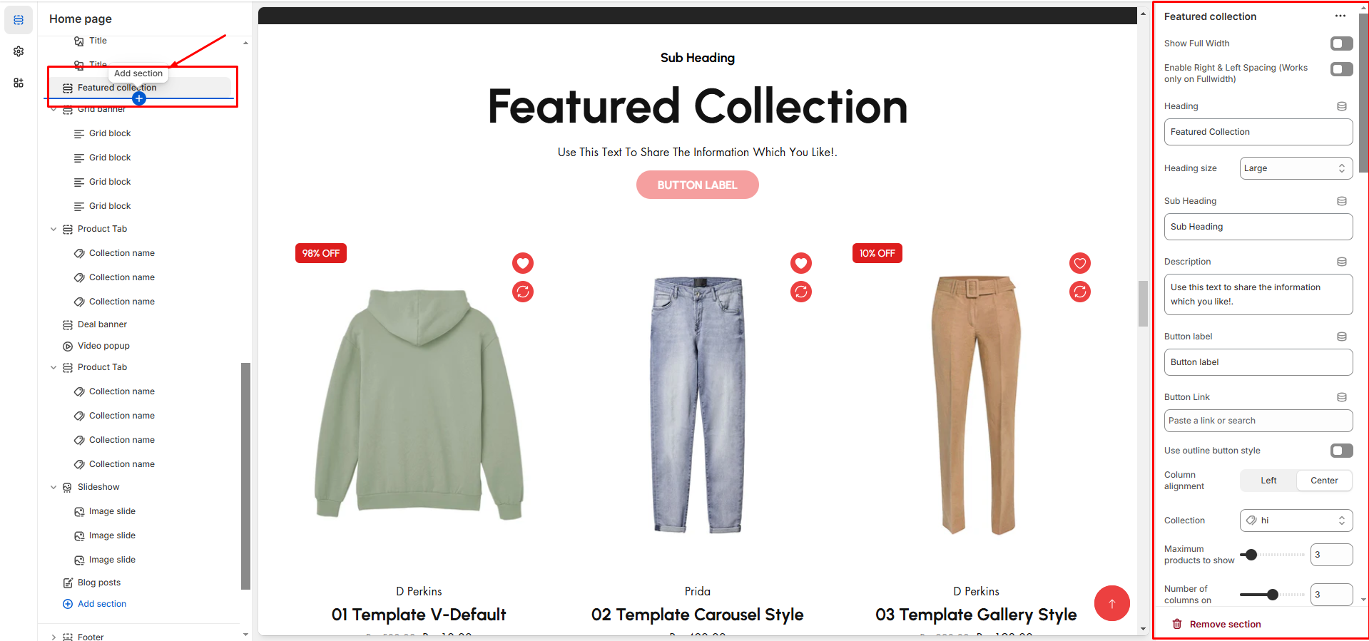
Image Ratio: There are 3 option image ratio as ( Adapt to image, square, and portrait) .Can choose the required style as theme requirement
Show Second Image on Hover: Display an alternate image when hovering.
Show Vendor: Display the product vendor name.
Show New Tag: Highlight newly added products as badge.
Show Product Rating: Requires a Product Rating App to display the product rating (App integration). Will display on adding rating to the particular product
Slider option: The range for displaying products can be adjusted based on the device type (Desktop, Laptop, Tablet, and Mobile) to ensure a responsive layout.
Pagination (Dots): Show navigation dots for better user interaction.
Navigation (Arrows): Enable left/right navigation arrows.
Auto Play Interval: Set the time delay between slides.
Enable Swipe on mobile: Allow users to swipe through blocks on touch devices.
Enable Controls: Display manual navigation options.
Column on mobile: Adjust based on mobile screen size can adjust to 1 column or 2 column..(works only the mobile swiper works)