Product tab
The Product Tab Section allows you to organize and display detailed information about your product in separate tabs . Below are the available customization options:
Go to Online Store > Themes > Customize.
Click Add section and search for Product tab (if available in your theme).
Click Save and preview your changes.
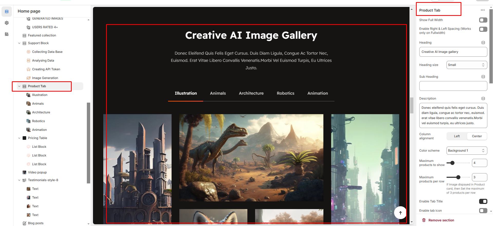
Show Full Width : Expands the section to the full width of the page.
Enable Right & Left Spacing : Adds spacing on both sides (works only in full-width mode).
Heading : Sets the main title of the section.
Heading Size : Adjusts the size of the heading (Small, Medium, Large).
Subheading : Adds a short description below the heading.
Description : Allows additional text to explain the section’s purpose.
Column Alignment : Aligns content to the left or center.
Color Scheme : Selects the background or text color styles.
Maximum Products to Show : Sets the total number of products displayed in this section.
Maximum Products per Row : Defines how many products appear in a single row (up to 3).
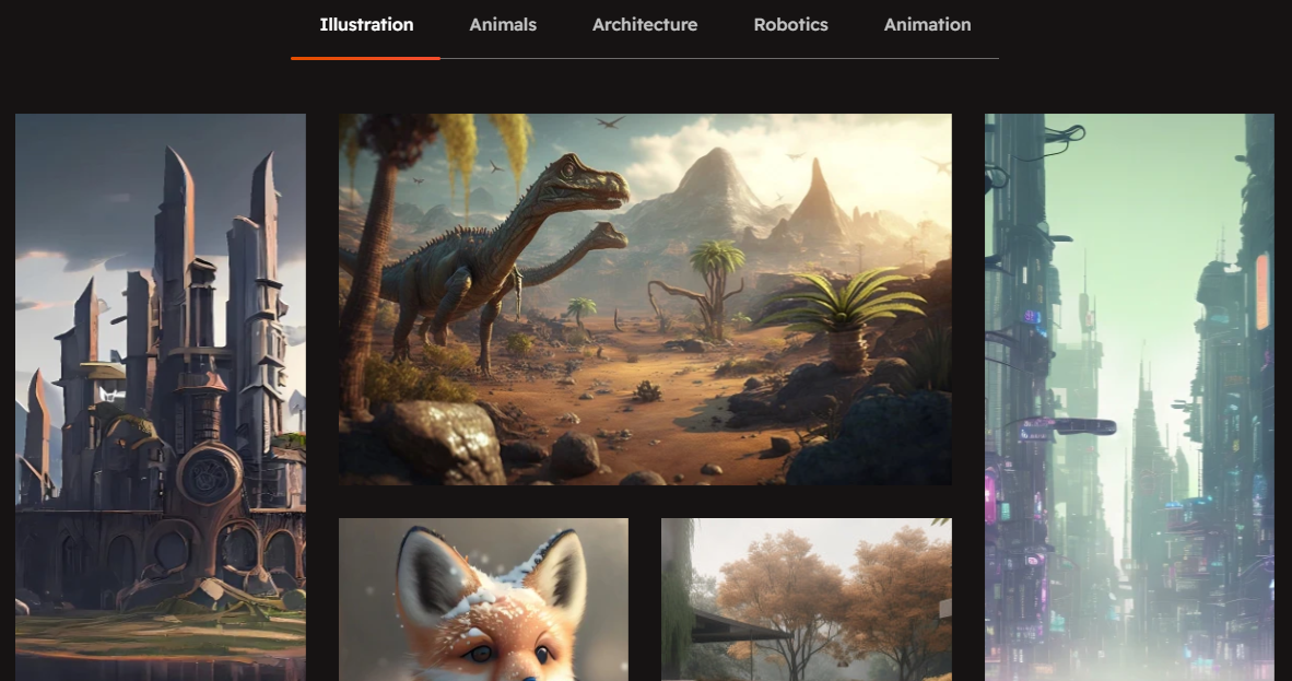
Enable Tab Title : Displays category names as clickable tabs.
Enable Tab Icon : Allows adding icons next to tab names.
Enable "View All" Shows a "View All" button if the collection has more products
Image Ratio: Choose how your product images look (square, adapt to image, portrait). "Adapt to image" means the image will fit its natural shape.
Desktop Layout: This controls where the product image and its accompanying information (like title, price, description) are arranged. You have a dropdown menu with options like:
Image first: The image appears first and the product appears second
Product first: The product appears first and the image appears second
None : To show only the tab product content and hide the image
Horizontal Position: Choose Left, Center, or Right to align the element's sides.
Vertical Position: Choose Top, Middle, or Bottom to align the element's top and bottom.
The Product Tab Block allows you to organize and display different types of content in separate tabs.
Tab Heading: You can add a heading for each tab. This is the title of the tab (e.g., " Tab heading’").
Image Block: You can add an image to each tab. This image can be related to the content of the tab (e.g., product images.).
Title: Each tab can have a title. You can set a title for the content displayed in that tab (e.g., "Product Features").
Title Link: You can provide a link for the title. This link will direct customers to another page or section related to that title.
Description: Each tab can contain a description. This text can describe the product's features, details, or any other relevant information that you want to display in that tab.