Grid banner
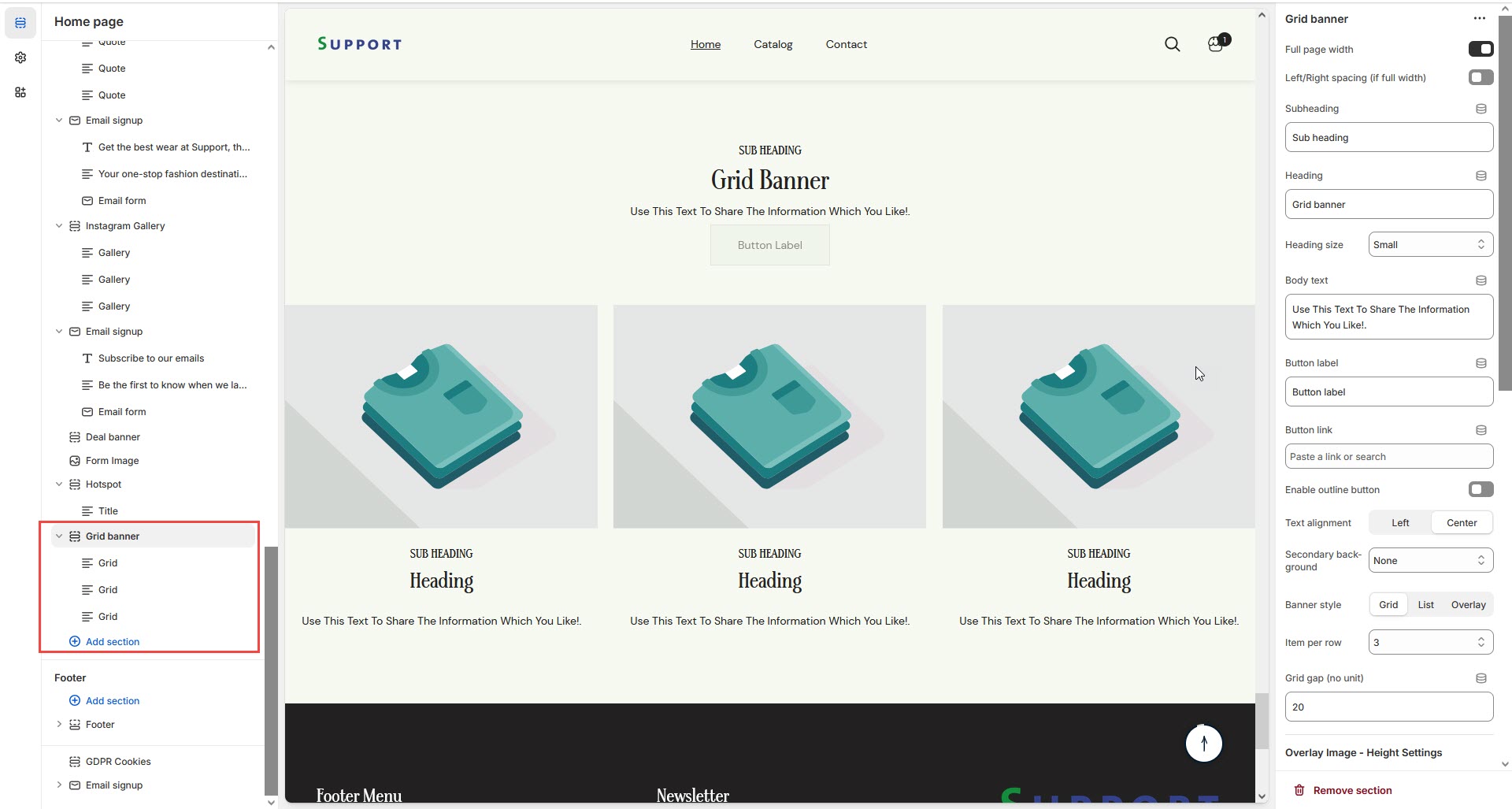
The Grid Banner Section allows you to display multiple banners in a structured grid layout, making it ideal for showcasing promotions, featured categories, or brand messages.
Go to Shopify Admin > Online Store > Themes.
Click Customize on your active theme.
In the Theme Editor, click Add Section > Grid Banner.
Show Full Width: Expands the section across the entire screen width.
Right & Left Spacing : Add spacing to the Full Width layout (applies in full-width mode).
Heading: Set a custom title (e.g., "Hot & Top Trends").
Heading Size: Choose for size Small, Medium, or Large
Subheading: Add additional text if needed.
Body Text: Add a description (e.g., "Best arrivals this week").
Button Label: Add text (e.g., "Shop Now").
Button Link: Set the URL destination.
Color scheme : You can customize the section’s appearance by changing the text color, background color, and more using preset color options.
Enable Outline Button: Change the button to an outlined style.
Column Alignment: Adjust content placement within the section.(Left,Center)
Secondary Background: Allow to disable the background or obtain the given background
Banner style:Can style the banner with 3 option Grid, List and Overlay
Item Per Row:Display the block to be display per row
Column Gap:Obtain to give space for the column (works only if the slider is disable)
Overlay image height settings: Used to adjust the height of the image on (desktop,laptop,tablet and mobile) (works only in overlay style)
Padding: Top Padding and Bottom Padding are used to adjust the spacing above and below a section in Shopify, improving the layout and readability.
Custom class: The Shopify allows you to apply unique CSS styles to specific sections, blocks, or elements within your theme.
Slider option: The range for displaying products can be adjusted based on the device type (Desktop, Laptop, Tablet, and Mobile) to ensure a responsive layout.
Pagination (Dots): Show navigation dots for better user interaction.
Navigation (Arrows): Enable left/right navigation arrows.
Auto Play Interval: Set the time delay between slides.
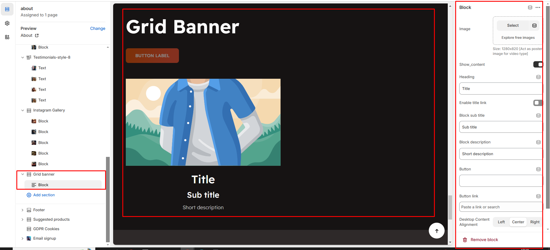
Without adding block to grid banner the section seems to be empty
Click Add Grid to insert a new grid item.
Upload Image: Add a high-quality image
Acts as a poster image for video-type banners.
Show Content: Toggle ON to display text and buttons.
Subheading: Add a short text above the heading.
Heading: Enter the banner title.
Enable Heading Link: Make the heading clickable.
Description: Provide additional details about the grid item.
Button Label & Link: Customize the CTA button and add a destination URL.
Text Alignment (Desktop): Adjust text placement. (Left,Right,Center)
Content Reverse:On enable the Position of the content is row-reverse or column reversed