Collection List
A Collection List allows you to showcase multiple collections together on a single page, making it easier for customers to navigate through different product categories.
Navigate to Shopify Admin > Products > Collections.
Click Create Collection and add at least two collections.
Examples: "New Arrivals," "Best Sellers," "On Sale."
How to Add a Collection List
Navigate to Shopify Admin > Products > Collections.
Click Create Collection and add at least two collections.
Examples: "New Arrivals," "Best Sellers," "On Sale."
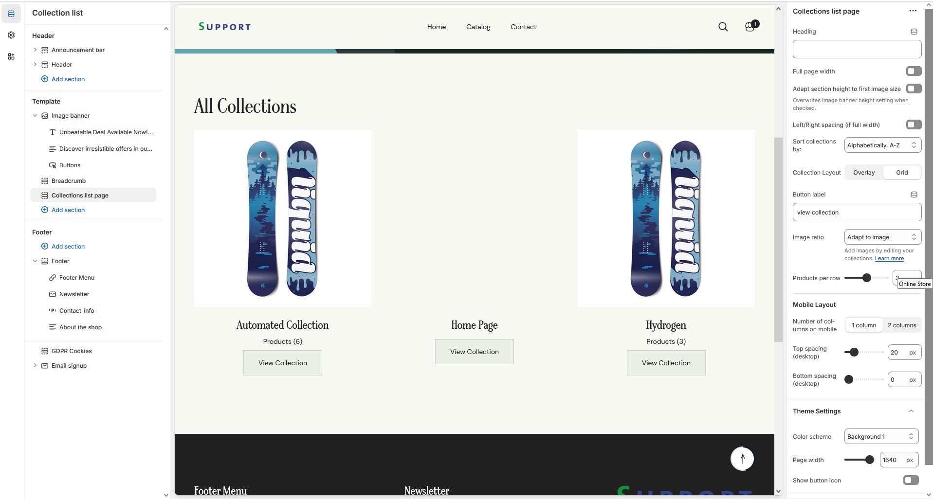
Go to Shopify Admin > Online Store > Themes.
Click Customize on your active theme.
In the theme editor, click Add Section > Collection List.
Show Full Width: Expands the section across the entire screen width.
Right & Left Spacing Toggle : Add spacing to the Full Width layout (applies in full-width mode).e)
Heading: Set a custom title (e.g., "Hot & Top Trends").
Heading Size: Choose for size Small, Medium, or Large
Subheading: Add additional text if needed. Body Text: Add a description (e.g., "Best arrivals this week").
Button Label: Add text (e.g., "Shop Now").
Button Link: Set the URL destination.
Color scheme : You can customize the section’s appearance by changing the text color, background color, and more using preset color options.
Enable Outline Button: Change the button to an outlined style.
Column alignment: Column can be aligned as per the content alignment requirement (Left,Right)
Image ratio: The ratio image can be alter using Square, Potrait and Adapt image option.
Number of columns on desktop:Allows to enable the number if collection in desktop
Enable "View all" button if list includes more collections than shown:Allow to enable the view button allow to view all created collection
Padding: Top Padding and Bottom Padding are used to adjust the spacing above and below a section in Shopify, improving the layout and readability.
Slider option: The range for displaying products can be adjusted based on the device type (Desktop, Laptop, Tablet, and Mobile) to ensure a responsive layout.
Pagination (Dots): Show navigation dots for better user interaction.
Navigation (Arrows): Enable left/right navigation arrows.
Auto Play Interval: Set the time delay between slides.
Enable Swipe: Allow users to swipe through blocks on touch devices.
Enable Controls: Display manual navigation options
Column on mobile: Adjust based on mobile screen size can adjust to 1 column or 2 column.
Without adding block to Collection list the section seems to be empty
Choose the collection to the block. Created in Backend
Select and Add Collection to block
Click Save